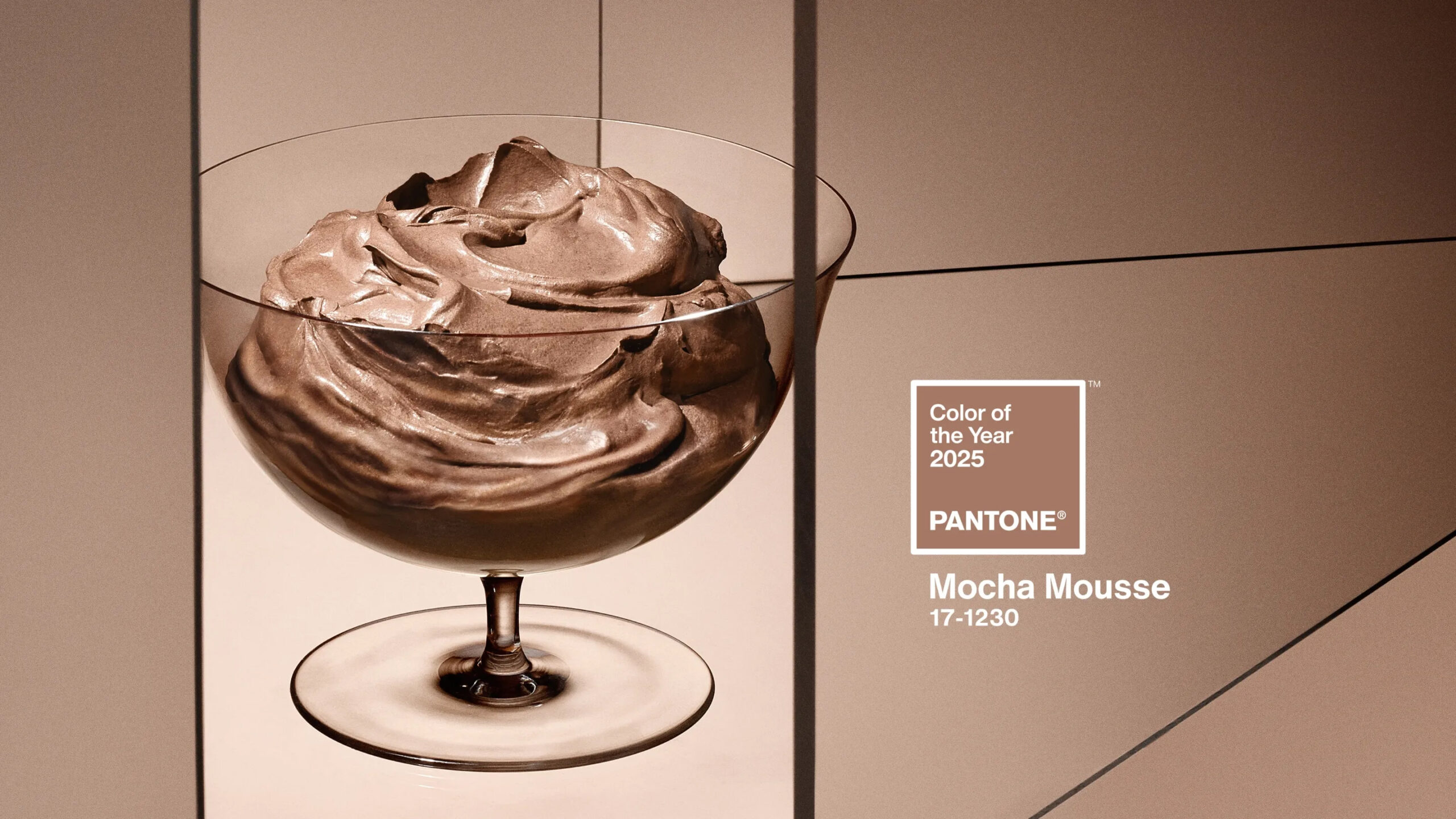
Every year, those of us in the art and design space eagerly await the announcement of the Pantone Color of the Year, and that day has FINALLY arrived! Okay, perhaps that is a slight exaggeration, but it’s always interesting to see what’s chosen by the folks at pantone. This year, they’ve stayed in the realm of warm tones (last year we was Peach Fuzz) and chosen Mocha Mousse.
Underpinned by our desire for every day pleasures, PANTONE 17-1230 Mocha Mousse expresses a level of thoughtful indulgence. Sophisticated and lush, yet at the same time an unpretentious classic, PANTONE 17-1230 Mocha Mousse extends our perceptions of the browns from being humble and grounded to embrace aspirational and luxe.
It’s that time again! Each year Pantone choose a “color of the year” that can help drive creative endeavors and design. Check out my image gallery celebrating this year’s color, “Classic Blue”. Here is some additional information on Pantone’s Color of the Year:
For over 20 years, Pantone’s Color of the Year has influenced product development and purchasing decisions in multiple industries, including fashion, home furnishings, and industrial design, as well as product packaging and graphic design.
A timeless and enduring blue hue, PANTONE 19-4052 Classic Blue is elegant in its simplicity. Suggestive of the sky at dusk, the reassuring qualities of the thought-provoking PANTONE 19-4052 Classic Blue highlight our desire for a dependable and stable foundation on which to build as we cross the threshold into a new era.
Imprinted in our psyches as a restful color, PANTONE 19-4052 Classic Blue brings a sense of peace and tranquility to the human spirit, offering refuge. Aiding concentration and bringing laser like clarity, PANTONE 19-4052 Classic Blue re-centers our thoughts. A reflective blue tone, Classic Blue fosters resilience.
Pantone is the company that provides color systems and serves as the authority for ensuring the accuracy of color profiles across the landscape of technology. Each year they choose a color to serve as thematic inspiration – and this year they have chosen “Ultra Violet” – Pantone 18-3838. From the Pantone website, Ultra Violet “. . . communicates originality, ingenuity, and visionary thinking that points us toward the future”.
Along with yesterday’s recognition of 2018 being the Year of the Bird, here is another approach to your creative endeavors in 2018 should you struggle to find a theme or a starting point for your next project!
Green is the theme for 2017, or so says color arbiter Pantone. The Pantone Institute of Color holds a clandestine meeting twice a year to determine a hue to represent the year, and to drive design. I can’t argue with that, having lived in the verdant Pacific Northwest all my life.
This is what we wait for every year. The new unveiling of the color that will dictate our lives for the coming months…
This time Pantone has selected an unprecedented two colors, Rose Quartz and Serenity, as an antidote to modern day stresses. When taken in moderation, they do have a very calming effect.
Splash a bit of emerald on your walls with a new print from Art Wolfe! Emerald is the color trend for this Spring!
“Green is the most abundant hue in nature – the human eye sees more green than any other color in the spectrum,” said Leatrice Eiseman, executive director of the Pantone Color Institute®. “As it has throughout history, multifaceted Emerald continues to sparkle and fascinate. Symbolically, Emerald brings a sense of clarity, renewal and rejuvenation, which is so important in today’s complex world. This powerful and universally appealing tone translates easily to both fashion and home interiors.”