Technique Tuesday: Scale of your Subject
The following is an excerpt from “The New Art of Photographing Nature“. Pick it up in my online store and check a gift off your list for the photographer in your life!

SCALE: HOW LARGE SHOULD THE SUBJECT BE?
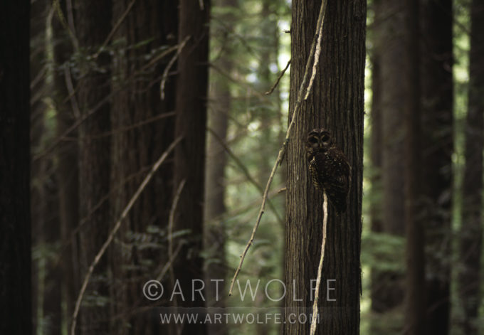
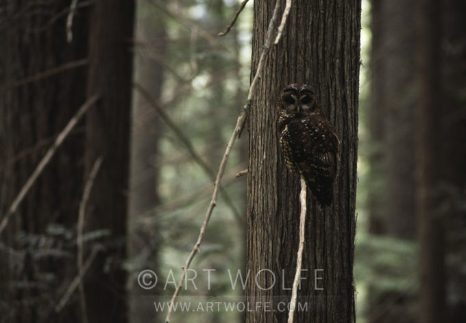
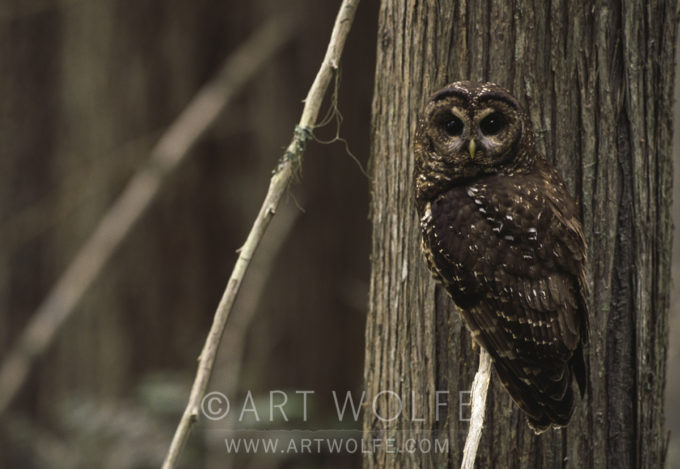
AW: In these three shots of a spotted owl, we see how the owl changes in importance according to its relative size in the frame. In my opinion, no image is stronger than the other; they simply say different things. The first composition is a shot of old-growth forest that happens to have an owl as an element (80mm lens). In the second, the owl is clearly more evident, and still enough forest shows to create a strong sense of place (200mm lens). But in the third, I’ve eliminated most of the forest and the owl is clearly the dominant element. It is a more rewarding view of the owl, and of the textures of the trees, which you can now fully appreciate. The sense of forest is definitely gone (400mm lens).

MH: In each of these images, the owl relates to his surroundings in a different way. In the first, he is hardly visible, blending in beautifully with his surroundings. It is interesting that here, the light-colored branch, rather than being a detracting element, actually leads our eye right to the owl. The forest, with its strong vertical lines, is clearly the dominant element in the frame. If I had a story to illustrate that emphasized the need to save lots of habitat to provide for one owl, I would use this version.
In the middle frame, there is much more of a balance between the bird and the forest. The owl stands on its own, without being overpowered by the trees. This would be a classic opening shot for a story on spotted owls and old-growth forests.

In the last image, you have a portrait of the bird. Now, too, the lighter limbs of the trees actually take over as the strong linear elements in the composition. The owl’s soft shape stands out against the harder lines of the tree trunks, without losing the feeling of camouflage we had in the first version. Unless I had text I wanted to drop out of the space on the left, I’d crop this to a vertical to emphasize the owl even more.
For more insights and technique tips, check out “The New Art of Photographing Nature”!


