Technique Tuesday: Conveying Scale
Looking for a sense of scale can be another way of defining a composition and influencing how you place your subject. Scale is simply a way to give the viewer perspective on how big the scene is within the photograph.
Once you understand how to use scale, you can decide in each case whether or not to include it. Sometimes abstract photographs look their best when there is no sense of scale whatsoever, while big landscapes need it to reveal themselves to the fullest.
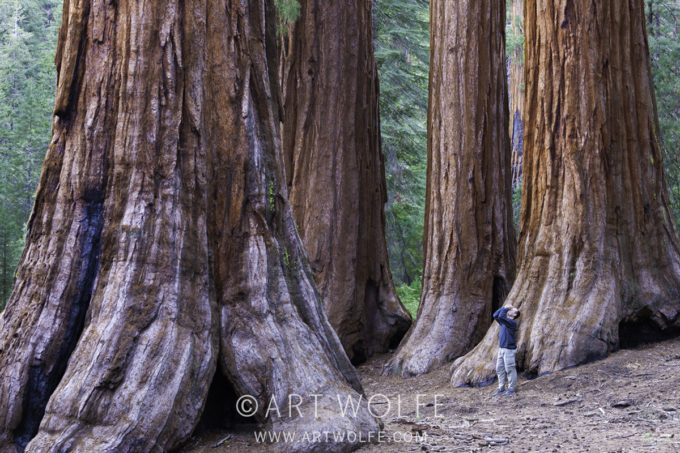
There are lots of things that can be used to convey scale within a photograph. Anything that is recognizable to viewers and will immediately convey an idea of its size will work. This is one reason why human figures are often used for a sense of scale in landscapes and street scenes. We know how big people are, and when we see a person in a scene, it gives us an idea of how big the scene is. People can also personalize a place and help a viewer better connect with it, such as in the example shown here of a visitor standing in Yosemite’s Mariposa Grove.

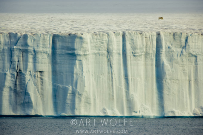
Other useful elements are items that people use, from vehicles to houses; these have a human scale that people understand. Animals also provide a sense of scale, as shown in the image below, as do certain types of plants, such as a big pine tree, another evergreen, or a large cottonwood tree—iconic types of trees that people recognize and have an idea of the size of.
The trick to using any of these things for scale is that they must look like a natural part of the composition. A big mistake that people make when trying to convey scale is to simply add something to the picture without thinking about how it integrates into the overall scene. That always looks odd and gives the feeling that the object was simply added as an afterthought—which it probably was!
Never compose your picture around the object that is there for scale purposes. Compose your picture based on the various ideas discussed in this and other chapters, then look for a way to incorporate your object so that it contrasts with the rest of the picture but does not start to look like the subject. When you’re using an object for scale, it needs to be a supporting character for the scene, never the star.
In general, things used for scale work best near the edges of a composition or along the bottom. Don’t slam them against the edge of the picture; that looks awkward; put a little bit of space between them and the edge. By placing these objects well away from the center of the picture, you are telling the viewer that there is an important relationship between this object and the rest of the scene.
This lesson and much more included in “The Art of the Photograph“.


Amazing article, thank you very much for sharing it here. Lessons like this are ivaluable for us amateur photographers. Your tv series Travels to the Edge inspired me and taught me a lot some years ago, and this Technique Tuesday has been equally inspirational and informative. Greetings from Brazil.
Fabulous and special article – working with scale is a great way of having the animal in an environmental setting – thanks Art
Peter, your images are amazing! I loved your website, congrats on the great results. Greetings from Brazil.
Love the Bear on the Ice shot. Great lesson. 🙂
Great article! Thinking about this a lot lately…