Technique Tuesday – Composition in Angkor Wat

Every successful image is comprised of several key elements that define its character: exposure, the balance and movement of the composition, the interplay of tone and color. Focal point and depth of field are critical components as well.
Picking a focal point and highlighting it with shallow depth of field makes the subject “pop“,but one risks over-revealing. Sometime the eye has nothing to do except dwell on the primary subject. Watch people in a gallery. They pass by an over-simple image in moments while an interesting composition engages them for a while.
I usually prefer to draw the eye across the frame, placing the focal point deeper in the composition. The focal point could be a strong design element, but nothing attracts the eye like brightness or a splash of vivid color.
When I construct a composition, something in the scene catches my attention. I immediately try to distill the image to its essentials, looking for anything that gets in the way of the design elements that attracted me in the first place. I feel my way toward the final composition. I don’t actually photograph each step of the journey, but I did here to illustrate the process.
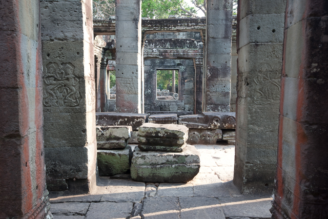
I shot this series in the ruins of a temple near Angkor Wat in Cambodia. In the first image (above) we see some strong vertical lines, but nothing grabs the eye. The bits of white sky are distracting; it is almost monochromatic, which is not a virtue with this composition.

In the second image we see a Buddhist monk in orange robes in the distance. We now have our point of interest, but it’s overwhelmed by the temple, and the bright sky continues to move the eye away from the real subjects.
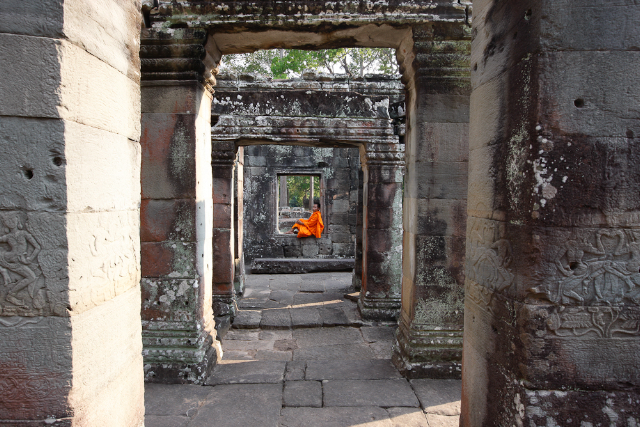
When in doubt, get closer. I moved in a little closer and zoomed to crop out sky above the doorway into the right. At the same time the sun on the floor is almost removed. Our monk is now a little larger, but there are still too many distractions from the main composition in the form of the remaining sky and foreground.
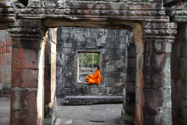
This time I got a lot tighter, driving extraneous elements out of the frame. (Cambodia4). The sky and bright triangle of light on the floor have been removed and there’s no question that the monk is the center of interest. However, the composition has become too symmetrical, too static for my taste. This is an acceptable image that I want to push a little farther.
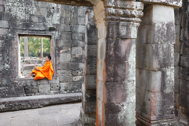
This photograph is well-balanced, and all those bothersome highlights are gone. The eye jumps to the monk but then there is more to see in the forms of the pillars. The monk is looking out of the frame, which is a minor issue that I could tolerate.
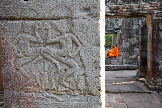
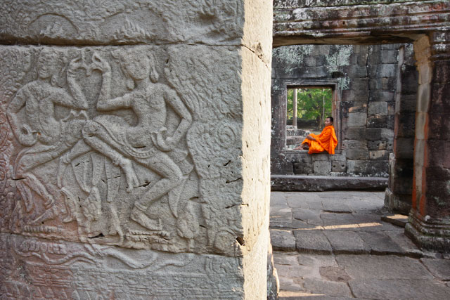
These final two images last two images work the best for me. They have strong graphic elements and can be read a number of ways. Although the monk still draws the eye, the bias relief of the dancing apsara (supernatural women, the wives of Indra’s court servants) is the first thing to draw the eye. Then, the bright orange forces your attention across the frame. Ordinarily, the bright vertical strip of sun lit sandstone would bother me, but in this case it seems like a border between the past and present and accentuates the verticals of the temple’s pillars. The monk seems a little crowded in the first photograph so I gave him a little more room in the final image.
